The Complicated Life of a Single Toggle Switch
When I first started building Mnemeo, the plan seemed simple. I missed the old Memrise typing mode, so I'd build an app that had a great one. But I also knew a simple Anki-style rating mode was essential for quick reviews or mobile use. The obvious solution: offer both.
I was surprised how few apps actually do this well. You can often get a typing mode in Anki, for instance, but it usually involves a fair bit of tinkering. So, making this dual-mode system a core, easy-to-use feature became one of Mnemeo's key differentiators.
But this humble toggle switch started causing architectural headaches.
Problem #1: Convenience vs Logic
The toggle is a global setting, so logically it belongs on the global "Settings" page. But for my own early testing, I slapped it onto every deck page because it was convenient. The problem was that it felt wrong. It was a global switch pretending to be a local one, living right next to truly per-deck settings. Heresy!
This was a classic battle between short-term convenience and long-term clarity. In the end, I decided logic had to win. A misleading UI is a form of friction, and my entire goal is to remove friction. I moved the toggle to its proper place.
Problem #2: The Default Dilemma
With the toggle now neatly tucked away, I had to decide what a new user would see first. I love the typing mode, but I had to admit that a simple rating mode is a much faster and lower-friction entry point, especially for someone signing up on their phone. So I made another pragmatic choice: the default for all new users would be Rating Mode.
Problem #3: Discoverability
I had just engineered a perfect nightmare. I had taken my app's most unique and powerful feature - the one I built the app for - and made it completely invisible to every single new user.
The risk of a user signing up for the typing mode, not finding it, and leaving was huge. I needed a way to make it discoverable without cluttering the clean, simple interface I was trying to build. I explored a few ideas:
- The "Always-On" Toggle: I considered putting the switch right on the study screen. But I rejected this - it felt like adding an unnecessary complication for an MVP, and my guess is that most users, once they find their preferred mode, don't want a toggle constantly taking up screen space.
- The "Helpful" Nag: I also thought about a persistent, dismissible banner ("Did you know about typing mode?"). Didn’t like this because adding a pop-up to an app designed to hopefully reduce cognitive load felt a bit ironic.
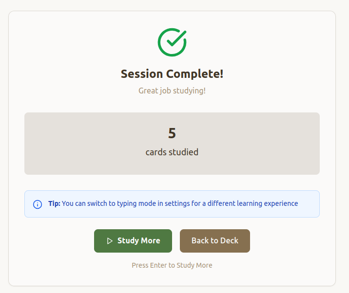
For now, I've settled on a simple "nudge." After a new user completes their first couple of study sessions, a small tip appears in the summary: "Tip: You can switch to typing mode in settings for a different learning experience."
It’s a classic design trade-off. This is my current solution, and I'm still gathering data on how well it works. It's funny how a single UI element can send you down such a rabbit hole of design decisions. What looks simple on the surface is often the result of a hundred tiny, deliberate choices.